Panorama Tributario

A monthly scientific magazine focused on accounting and related topics, featuring discussions led by different professionals in the field.

CategoryEditorial
Year2015
ClientEscuela de Impuestos

Panorama Tributario is a scientific publication with a subscription-based payment model that targets accountants and other professionals in similar fields. It provides information and news about the laws, practices, processes, techniques, and technologies that guide accounting and other administrative jobs.

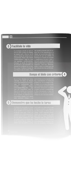
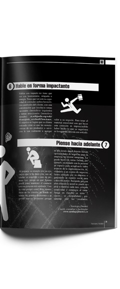
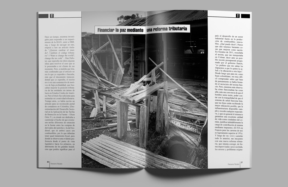
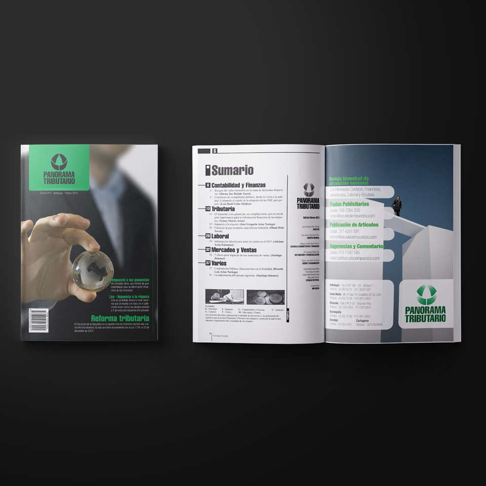
As part of the project, I was responsible for designing the layout and visual style of the publication and its cover.

Working under tight deadlines, I aimed to create a design that was visually appealing, easy to navigate, and optimized for readability.

The design also needed to be flexible enough to accommodate a variety of content types, including articles, news updates, and technical reports.
Research

Based on the marketing data analysis, we were able to create a persona that represents the average subscriber for the Panorama Tributario publication.

Gregorio (48, M) Accountant (CO)

Marketing data shows that was attracted to the publication's cover design, but he didn't read the entire magazine. However, he expressed disinterest in reading the entire content of the magazine, indicating a need to improve article accessibility and consumption.

Target audience for Panorama Tributario: academics and professionals in accounting, management, and related fields in regions where the company operates. This includes both current subscribers and potential subscribers.

Panorama Tributario's diagramming and graphic style requirements aimed for readability, cost-effectiveness, and a distinctive visual identity. The challenge was to balance these with niche requirements, such as catering to new readers.

Work Process

W used bold colors, images, and typography to make the publication stand out and appeal to a wider audience.

It was integrated throughout the publication to keep readers engaged and interested in the content. Furthermore, the use of the organization's colors throughout the design helped to create a visual identity for the publication.

By considering our target audience, we exceeded their expectations with the publication.

Approach

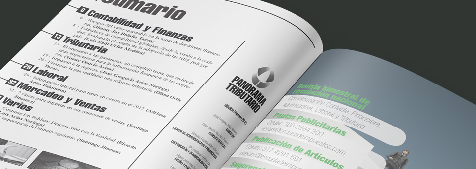
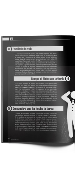
In terms of navigation, the team used a double pagination system, with numbers for pages and letters for sections. This approach was intended to make it easier for readers to find what they're looking for quickly, as well as to provide a more user-friendly reading experience overall. By addressing the needs of the fictional subscriber in this way, the team hoped to increase the publication's appeal and overall readership.